1. My project's message was to show the strength and rewards of perseverance and learning to love and learn from your mistake. I showed this by having the willow tree sprout slowly maturing from a hard environment into a huge tree tall enough to transcend the mountain behind. The cover also shows the myth of the dragon's gate, where carp swim up a ruthless waterfall in order to become powerful serpents.
2. The project is interactive in the way that it has pop ups.
3. My color scheme is analogous in green and blue.
4. My emphasis on the fish on the cover, and the full grown tree on the inside.
Friday, June 9, 2017
Friday, June 2, 2017
Thursday, June 1, 2017
Monday, May 22, 2017
Frankenstein Creature project Final
The photoshop tool that was most helpful to me was the adjustment layer tool. This tool helped me to both blend the different parts of the animal together, and to make the creatures and the background more coherent. It also helped me to make the colors match each other and overall make the animals more natural looking and fitting to the environment
Juxtapose Challenge
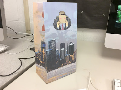
In this image, I portrayed visual interest by using very whimsical images such as the child and the city. I also strayed this by overlaying an electron microscope text to add to the overall dream-like essence of the work. I also did this with the clipping mask in order to blend i all together and make it more coherent.
Tuesday, May 9, 2017
Monday, May 8, 2017
Thursday, May 4, 2017
Wednesday, May 3, 2017
Monday, May 1, 2017
Tuesday, April 25, 2017
Friday, April 21, 2017
Tuesday, April 18, 2017
Monday, April 17, 2017
Thursday, April 6, 2017
Monday, March 27, 2017
Poster Ideas 1
Quote:
I would much rather have men ask why I have no statue than why I have one.
(μᾶλλον γὰρ,’ ἔφη, ‘βούλομαι ζητεῖσθαι, διὰ τί μου ἀνδριὰς οὐ κεῖται ἢ διὰ τί κεῖται)
- Cato the Elder
I want to have a serious mood.
(μᾶλλον γὰρ,’ ἔφη, ‘βούλομαι ζητεῖσθαι, διὰ τί μου ἀνδριὰς οὐ κεῖται ἢ διὰ τί κεῖται)
- Cato the Elder
I want to have a serious mood.
Friday, March 24, 2017
In this design, I used the color, background, size, font, and texture to show the meaning of the word camouflage. The colors are very muted and complex, and they blend in with the background to show the the word is disgusted. The background provides the means of camouflage, making the word inconspicuous, and the medium size and font make the word less noticeable. The texture of the sand as well helps the word blend in.
In this design, I used the font, background, colors, orientation, and size to convey the meaning of the word active. The font is very curvy and not straightforward, and the background has the patterns and copies of the text to make the whole thing more active. The colors pop and are very obnoxious to make it very active, and the orientation has the letter moving around. The size also puts the word right in your face, adding to the feeling of activity.
In this design, I used shape, color, background, font, and the orientation to make the word look like what it means. The shape is very large to make it more rambunctious, and the colors of the word are red and white to contact with the green background. I made the font very bold and strong, as well as making the orientation spill off the page to give a feeling of loudness.
I made the word textured look like what it means by manipulating its font, color, texture, shape and background. I used the font Chalkduster, which is very textured, and used the color dodge mode to make the colors and texture stand out. I also put the word in an arc to make its texture stand out more, and well as putting a rough texture into the text. Finally, for the background, I used a very textured image and also used the bled tool ad lines to point more so to the word.
Monday, March 13, 2017
Screenshot Envy
Thursday, March 9, 2017
Wednesday, March 8, 2017
Monday, March 6, 2017
Book Cover
1. The emphasis in this cover is the people running.
2. This design shows competition in the way that it shows that the rest of the book will be about this concept, using a foot race as an example.
2. This design shows competition in the way that it shows that the rest of the book will be about this concept, using a foot race as an example.
Subscribe to:
Comments (Atom)


